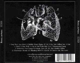
Florence and The Machine's digipak is made up of a few main colours - black, white, purple and a variety of neutral colours like beige and brown. These colours play a key part of the digipak as they create an image for the artists. The use of neutral colours shows the audience that they are not trying to be fancy, or sell the album relying on fancy attractive packaging. This is very typical for indie pop artists as they don't tend to dress up too much or rely on fancy packaging , which is what I've seen in most of the digipaks and adverts I've looked at so far. The colours represent the artists' personality and show calmness and peace. Florence and the Machine often use a similar colour palette which makes their products easy to spot and stand out from others. Fans of their music will know what to look for when they go to buy their album and will expect a certain style of the overall package. The background of all sides of the digipak is black and the writing is in white which makes it stand out and add to the simple image of the digipak.
The fonts that have been used in this digipak are simple but well chosen. There is a variety of fonts which shows that they are quite artistic and exciting. There are different fonts for the title of the album and the name of the artist. The font at the top looks handwritten and more loose where the name of the album at the bottom is a bit more structured and 'in place'. 'Florence + the Machine' is placed at the top of the CD cover, whereas the title of the album is at the bottom. This has done because people look for artist's name and then for the album title when they want to buy a product and this way it is easier to spot what artist the album belongs to. The different fonts make up for the lack of colours in the writing, which prevents it from looking dull as they are picked well to suit the artist's personality and appearance.
The title of the album - 'Between Two Lungs' is quite unusual and makes the audience more excited to hear it. The title isvery simply but effectively related to some of the images used in the album digipak which are quite literally pictures of lungs. This has a nice effect on the overall look of the digipak as it shows a simplistic but smart idea and suggests that the songs will be straightforward but meaningful.
All of the pages of the digipak are have a white line going around the edges of the images and text. This creates a nice frame which surrounds the main parts of the page and helps the eye concentrate on the middle of the page where most of the information is given. This effect puts the pages together and creates a clear structure of the pages.
What I noticed about the images was that the artist isn't looking at the camera, as if she is trying to prevent 'eye-contact' with the readers. This could be because the artist prefers people to concentrate on the whole page instead of just on her face and it makes her personality look more mysterious and hidden to the audience, which attracts their attention.

There are some key elements that differentiate the advert from the digipak such as the date when the album comes out and a in this case more detail from the picture (the flower on her right handside, which you can't see well on the digipak cover). This draws attention because it gives important information about the album and sometimes it says where you can purchase the album from. The purpose of album adverts is increase awareness about the up-coming album and it is especially aimed at the artist's existing audience who are likely to be very interested in any new product coming out from that artist.
The album advert has the same features as the digipak cover - the frame, the picture, the fonts and the colours are the same, however the digipak contains more information such as song titles, images of the artist and the company which is producing it. All of this is done in order to create customer satisfaction or in other words to make the fan feel like the album was worth buying, not just for the music but for the additional content too. In comparison to that, what the advert tries to do is to get people to buy it when it comes out.
This is an additional video advert of the album which I found on YouTube about the upcoming album:


This needs a bit of work. The poster you have picked is not advertising the digipak. it is advertising a gig so this needs to be changed.
ReplyDeleteThere is more to say I think. The packaging has a vintage style. Does this fit in with your genre? Also, I am not sure that just because the colours are muted that it means they are not trying to see the album with fancy packging. It looks quite fancy still.
You have got images for all parts of the packging which is good. Try and alk about each part. This will help you later when you plan your own.